With the release of the recent Pantone Color report and the publication of the September issue of Vogue magazine, we get a peek into some fresh ideas for colors and shapes for Spring 2016. With winter right around the corner, not being a great fan of the cold and snow, I am happy to dream of spring.

In this post, I’m going to share with you some of my impressions and ideas that I’m going to be playing with this winter in anticipation of warmth and sunshine.
First, let’s talk about color. After I download the report, I begin studying it by separating out the colors according to the color wheel. This helps give me a sense for the direction the palette is leaning. Here is how I organized the Spring 2016 palette:
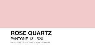
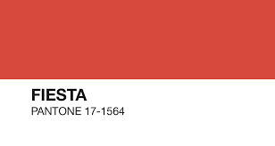
Red – Rose Quartz; Fiesta
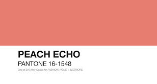
Orange – Peach Echo
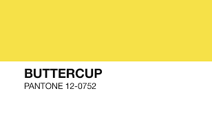
Yellow – Buttercup
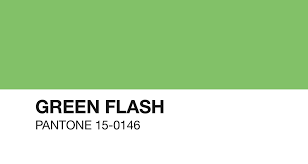
Green – Green Flash
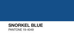
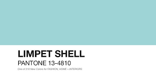
Blue – Snorkel (deep navy); Limpet shell; Serenity (very light)

Purple – (nothing)
Neutrals:
Brown – Iced Coffee

Grey – Lilac Grey
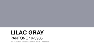
From taking this approach, I can see that the palette is heavy on the Blue-Green area of the color wheel with virtually no purple represented. I was on the fence about Lilac Grey…is it a “purple” I asked myself more than once. In the end, I decided if I had to make a hard call, it wasn’t. There is plenty of warmth too in the palette to provide some spice and excitement with colors such as Fiesta, Peach Echo and Buttercup. One thing I really like about this array of colors is the selection of neutrals which includes Iced Coffee and Lilac Grey; however, I would also push the deep navy of Snorkel into being a neutral as well because it is so dark.
In about a week or so, Pantone will announce which of these colors is going to be the 2016 Color of the Year. Since this year was from the Red family (Marsala) and last year from the Purple family (Radiant Orchid), I’m hopeful for Limpet Shell, Snorkel or Serenity. We shall know soon!
From reading the color reports over the last several years, one of the evolving trends is creating a palette that are unisex in nature. It’s a little hard for me to imagine with some of these colors though. I’m not sure if this idea will eventually become a full reality where we see the same colors used in both men’s and women’s fashions.
As for translating the palette for use with fiber art intended for fashion, I really like a couple of combinations that I intend upon working with in the coming months:
Rose Quartz + Lilac Grey + Iced Coffee
Snorkel Blue + Green Flash + Lilac Grey
I will be dyeing fiber in these colors as well as combing through my stash for what I might already have and create some woven fabrics.
Now, let’s turn our attention to some of the exciting upcoming fashion trends that will lend themselves to our own “fibery” interpretations. There is a lot of good news for folks like me that like a “boho” vibe.
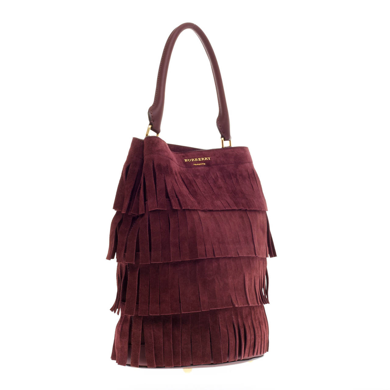
One of the biggest trends coming is very wide, cut fringe whether it is the hem of a skirt, the trim on a purse of in layers on a dress. For those of you that like to make finger fringe on your saori weaving, that technique will be right on point.
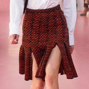
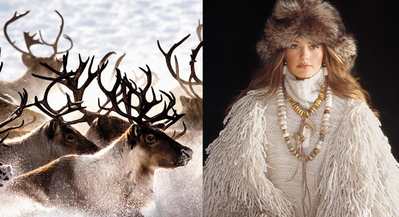
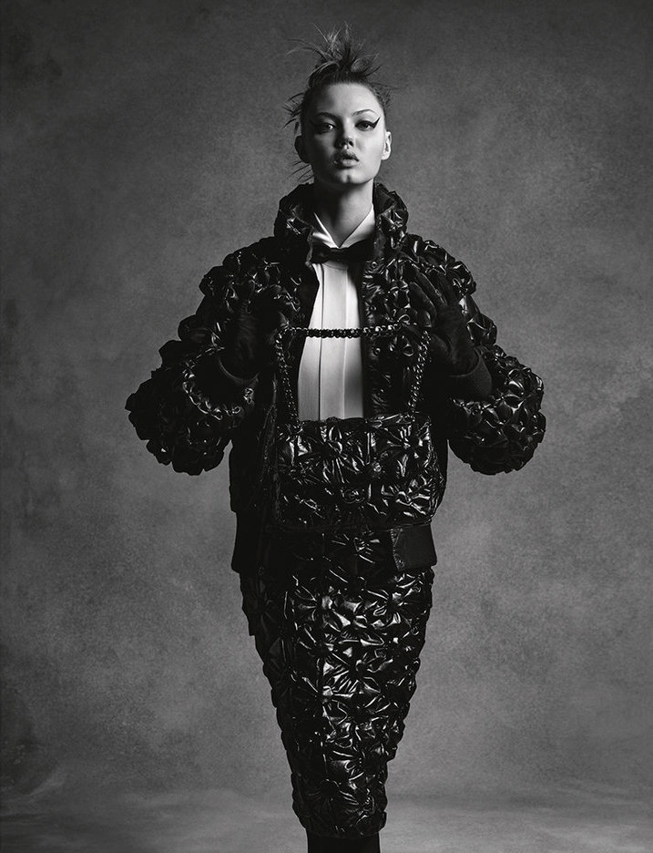
There are going to be a lot of experimental textures coming as well: crocodile skin jumper style dresses; parachute, puffy skirts; and shaggy vests. This means there will be awesome possibilities for incorporating highly textured yarns into wearables.
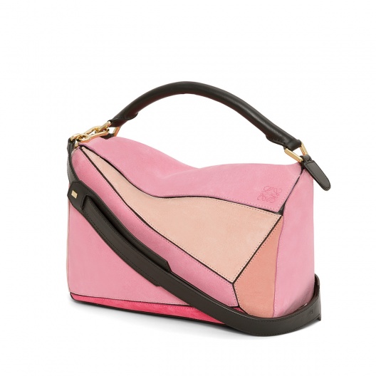
Color blocking continues to be important especially in accessories such as purses and totes. So, get out your solid colored yarns and fibers and start experimenting with some fun combinations using the Spring palette. Some of my ideas to try are Rose Quartz with Fiesta and Snorkel with Serenity – this is a combination that would make a stunning and fresh look for a spring purse. Here’s Loewe’s Pink Suede Puzzle Bag — I love this sharp take on color blocking.
OK, there you have it! I am really excited — Spring 2016 holds fresh design possibilities with both color and texture that will translate easily into weaving, knitting, or crochet. What are your thoughts on how to use some of these ideas?

Thank you for sharing this and your thoughts about 2016 color trends. I’m hosting a spring fashion show and this is very helpful. I’m happy about the fringe thing. I fringe everything….. 🙂
another great read….and the colors are inspiring….
Thank Arlene, this is a great way to begin focus for the next layer of projects
All the texture is exciting for Art yarn. The color trend suits you perfectly! Thanks for the heads up, boas will be Boss!!!
Thanks Arlene, this post makes me enthousiastic for weaving with my hand dyed and spun funyarns for spring projects.
I love the colors!!
Pingback: Colors of the Year? + Fleece Revealed Giveaway Winner – Fiberygoodness